Gallagher Brand Refresh

My Involvement
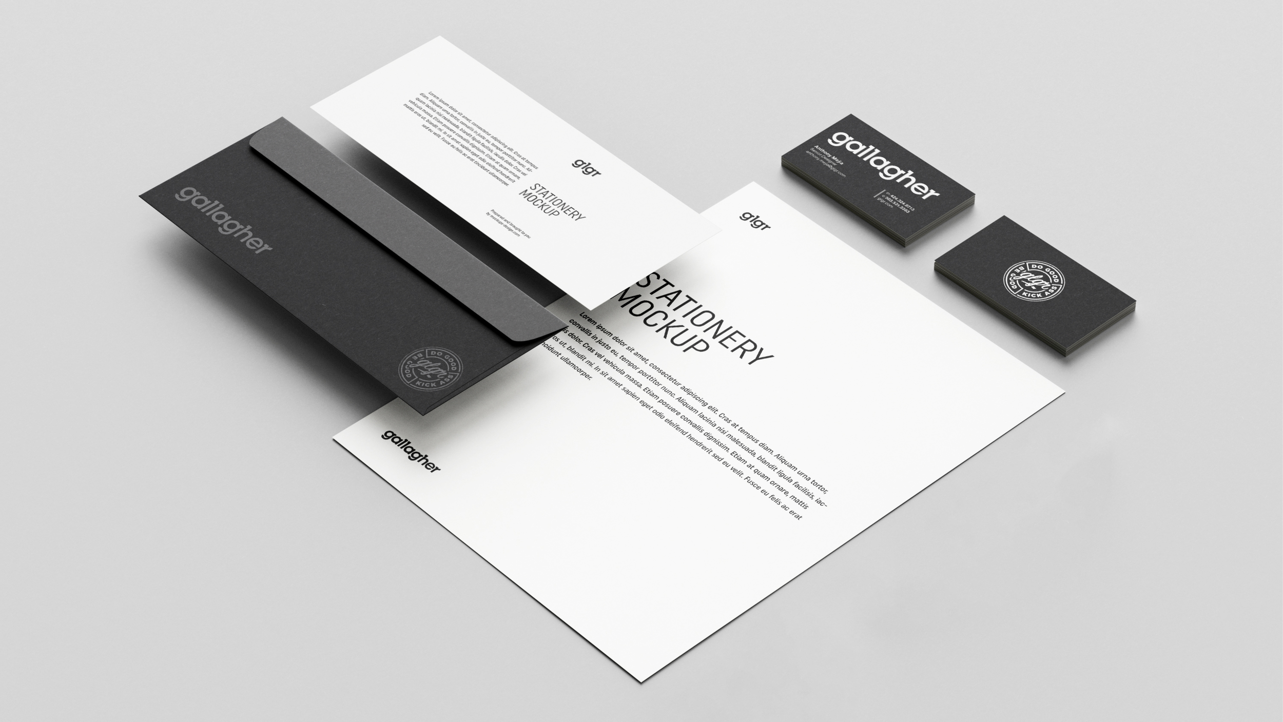
I was the lead creative for the Gallagher brand refresh. Gallagher didn’t want to stray too far away from where the branding currently sat. The first thing we did was agree to remove the brackets. After adjusting the kerning to increase legibility, especially at smaller scale, I began removing unnecessary slab serifs on letters like the “a” “l” and “h”. The brand refresh included a new Gallagher website that I also designed. You can see the website here.

Logo Overlay
Here you see the updated logo (shown in white) overlaid on the previous logo (shown in magenta). You begin to see how much more legible the updated logo is and the amount of space between letters that has been relieved.
Primary Logo

Secondary Logo
Do Good Be Good Kick Ass Badge